Civic icons and images
Visuals to enhance your website, voter guides, posters, and mailers
What you’ll need
- Access to the Google Drive database of civic icons and images
- The staff member(s) that are responsible for creating digital content or physical materials
- The materials you wish to add the civic icons and images to, and your preferred software to edit them in
- Adobe Illustrator if you want to make significant changes to an image
Getting started
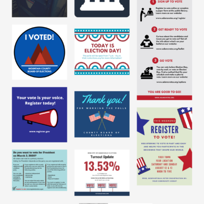
The first step to use these icons is to visit the Google Drive folder where they’re stored and browse the library. You can review the library catalog to see a complete list of the images without browsing the collections.
The images and icons in the library are organized into collections with several file types – PNG and SVG for web, JPG and TIF for print, and Adobe Illustrator AI source files. For more information about file types, see “Choosing the right file format” in the Using the Tool section below.
Tips for browsing the library
Pay attention to file names. We’ve tried to be descriptive while keeping the titles simple.
Try viewing the collections in grid view. Although you won’t be able to see the entire image in the case of larger files, grid mode is excellent for skimming a folder quickly. To use grid view, click the icon in the top right. To toggle back to the list view, click the list view icon.![]()
Preview and scroll. Start by clicking on any image. Then, use the left/right arrows to scroll through (on a touchscreen device, you can swipe to scroll).![]()
Download one image at a time by selecting a file, right-clicking, and selecting Download.![]()
Download many images as a zip file by selecting multiple images, right-clicking, and selecting Download. Or, you can download an entire folder by clicking the folder name and selecting Download.![]()
Using the Tool
1. Choosing the right file format
You’ll notice that the icon folders contain several subfolders – each with a different file type. Each image file type is suited for a particular purpose, so be sure to select the file format that fits your use.
- TIF files work well for making posters and large-size documents because they can be scaled large without pixelation or distortion.
- JPG files are well suited for use in printed materials and Word documents. JPGs will become pixelated if scaled too large.
- PNG files are ideal for web publishing. They’re also useful in Word documents when you need a transparent background.
- AI files are the best file format for making significant changes to the original image. This format will require Adobe Illustrator software.
2. Resizing images
Regardless of your file format, your images come in a default size, and you may want to resize them to suit your needs.
To resize your image on a PC using Microsoft Paint:
- Right-click the file for the image you want to resize, scroll down to Open with, and select Paint.
- Once your file is open in Paint, go to the menu above the image and click Resize.
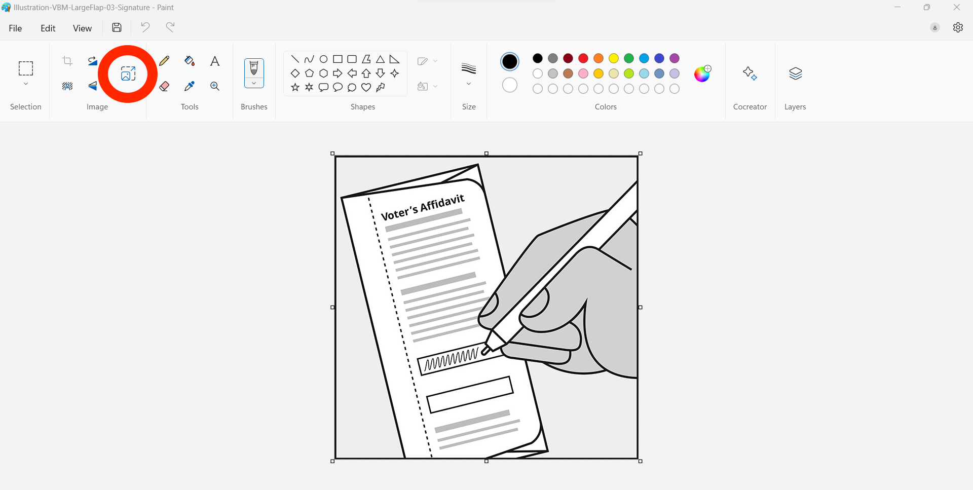
- You can choose how to resize the image in the pop-up box. First, make sure that Maintain aspect ratio is selected (the circled blue box in the below image); this setting will make it so that changing your file size won’t distort the image.
To resize by percentage, select Percentage and enter your desired percentage into the Horizontal box. The Vertical box will automatically match your input. If you want to resize according to the number of pixels, select Pixels and enter the size you desire into the Horizontal box. The Vertical box will automatically match your input. Once you’ve entered in your information, click the OK button, and Paint will resize your image.![]()
- You still need to save your image for the resizing to stick. Go up to the file icon menu and select either Save or Save as, depending on whether you want to replace the original file with the resized file or if you want to keep both.
To resize your image on an Apple computer using Preview:
- Double-click the file for the image you want to resize, and your computer will open the file in Preview.
- Once your file is open in Preview, go up to the Tools icon, click it, and select Adjust Size.
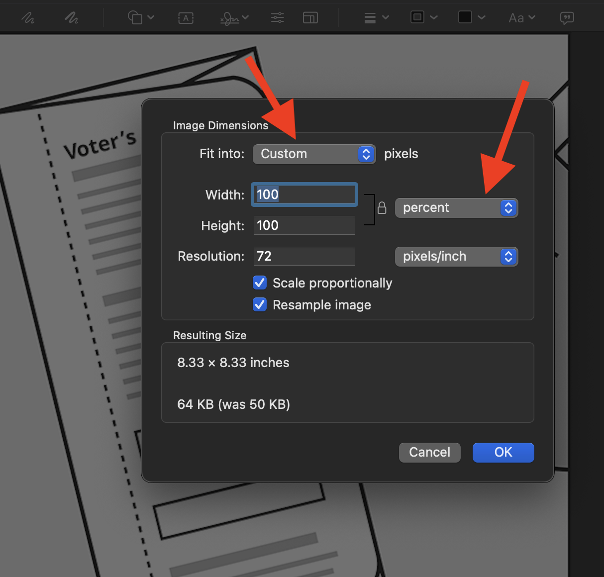
- In the pop-up box, you can choose from several options for how to resize the image. Make sure that Scale proportionally is selected; this setting will make it so that changing your file size won’t distort the image.
- If you want to fit the image into a pre-determined size, go up to Fit into, click the drop-down menu beside it, and select the size you want. If you want to resize by percentage, pixel, inch, or another special metric, choose the metric from the metric drop-down menu and enter the size you desire in the Width box. The Height box will automatically match your input. Once you’ve entered your information, click the OK button, and Preview will resize your image.
3. Positioning images effectively
Your images must be carefully positioned in your document to be as effective as possible. Keep in mind these basic design principles when considering where and how to position civic icons in your materials:
- Contrast emphasizes what’s important. You can use contrast by differentiating your icons from each other or from other elements in your document.
- Repetition is achieved by repeating elements throughout a document. Using icons consistently can contribute to a clean, uniform appearance and make it easier for readers to use your content.
- Alignment is connecting every element via an invisible line. It makes sense to align your icons to give your document a sense of order.
- Proximity is achieved by grouping things together that are related to one another. Empty space, or white space, helps keep your document clean and will help call attention to your icon. Your icon should be in close proximity to the relevant content.
Make it a group effort when deciding where and how to place your images. Ask members of your staff to give their reaction to the way you’re positioning icons to ensure that readers are responding to them as you intend.
4. Adapting icons to match your brand
Nearly all of the images in this tool come in black and white so that they are easy to see and understand in small sizes, in print, and online. If you want to change the image colors to fit your brand colors, your graphic designer can adjust the colors using a professional graphics editing program.
If you change the colors, use color combinations with clear, strong contrast to make the icons easy to read and understand.
5. Making icons accessible
As visual tools, icons and images can be quite helpful to sighted people, but what about people who can’t see them?
Even though people with disabilities may not be able to actually see your icons, they should still be able to access the meaning and purpose of each icon. Through thoughtful placement and textual aids, you can ensure that your icons are helpful even to everyone, regardless of ability.
Here are some guidelines to help you make your civic icons more accessible:
- Managing links with icons. If the image is included as part of a link, make sure there’s only one link — not one link for the image and a separate one for the accompanying text.
- Using alt text to communicate your icon’s purpose. If you’re using an image that contributes additional meaning and isn’t purely decorative, make sure to include helpful alt text. The image folders in these collections come with suggested alt text in the read.me file, but you may want to alter it or add additional alt text.
How do you write good alt text? What should your alt text say?
When writing alt text, it’s tempting to just describe what the image looks like. But that’s the wrong idea. Instead, your alt text should explain the purpose behind the image, or it can indicate what’s happening in the image. Look at the image and consider what extra idea or point it’s contributing.
For example, if you’re using an envelope icon to show that it needs to include a stamp, the alt text might say, “Envelope with first-class postage stamp” or “Be sure to put a stamp on the envelope before you mail it.”
Remember that there’s no need to precede alt text with a notation like “Image” or “This graphic shows” because screen readers already make that clear.
In your HTML, alt text will take a form like this:
alt=“The Hardin County courthouse”
- If you’re using an image that serves only a decorative purpose and does not contribute an idea of its own, no alt text is needed. If you’re working with a PDF, mark the image as a background. If you’re using another platform, insert null alt text (alt=“ ”). These settings will allow screen readers to skip over the image.
- When using an icon to illustrate instructions, ensure the alt text is written in context. In other words, your alt text should fit logically in the sequence of the instructions at the precise point where your image appears. This way, the alt text won’t just repeat information already in the instructions.
Because every publishing program is different, adding alt text to images varies from platform to platform.
To get an excellent overview of making images accessible through text, check out this presentation on how to write great alt text created by Whitney Quesenbery of the Center for Civic Design.
If you want some additional guidance for creating alt text, consult this helpful decision tree for writing alt text created by the website 4 Syllables.
6. Licensing for public use
This generic election administration resource can be shared and used far and wide, provided that you do not sell the materials or their derivatives. It is available under a Creative Commons Attribution-ShareAlike 4.0 International License. See our Terms of Use for more information. You should check with your state or county attorney to see if you’re able to use it.
Customizing for your officeCustomizing for your office
Any tips for customizing this resource for my office?
These icons are built to be easy to use. If you want to change their color or alter them slightly, you can change them in Adobe Illustrator or another similar program.
How do I know if this resource is helping?
The civic icons and images are helping if your materials are easier to use and if they look more cohesive and organized. You can try out your materials to see how easy or hard they are to navigate with the Usability Testing Toolkit, produced specifically for election offices.
Which Standards of Excellence does this resource support?
- Information design
- Language access
- Voter communications
Which Values of Excellence does this resource support? Why?
Values for the U.S. Alliance for Election Excellence define our shared vision for the way election departments across the country can aspire to excellence. These values help us navigate the challenges of delivering successful elections and maintaining our healthy democracy.
Alliance values are nonpartisan and designed by local election officials, designers, technologists and other experts to support local election departments.
You may find this tool especially helpful for this Value:
- Voter-centricity. By using consistent, well-designed icons, you support voters in navigating all stages of voting.
To learn more about the Values for Election Excellence, and to see the full list, visit the Alliance website.
Sharing feedbackSharing Feedback
How was this resource developed?
This resource has been tested with voters, and put into practice with elections offices across the country. Share your experience with this resource and improve it for your peers by reaching out via support@ElectionExcellence.org.
The library is an ongoing project that has grown organically through lots of requests from election officials and from projects CCD worked on that needed new illustrations. CCD is always happy to hear your ideas or image needs as we look to extend the library and make it more useful. You can reach out to CCD at hello@CivicDesign.org.
How do I stay in touch?
- For the latest news, resources, and more, sign up for our email list.
- Have a specific idea, piece of feedback, or question? Send an email to support@ElectionExcellence.org